A beginner to advance map making guide that assumes the user has a basic understanding of the interface. Includes step by step instructions, design help, known bugs, and helpful tips to get anyone on their way to making great OGAT maps for the community. Lots of good information to help any level of map maker.
Introduction
Map-Making can be a complicated mess to get through in OGAT. And once you do slug through making a map, you publish it and find that it has a million errors you had no clue existed. However, it is possible to make very clean, well lit, nice looking maps that offer a fair amount of balance. It just requires utilizing a good process and taking the time to polish the map until everyone finally sees the gem you envisioned before beginning. I’ve made around 14 large office-like maps at this point. While they aren’t perfect, I know the ends and out of the map maker and what is required to make a decent map. This guide is here to help give you a step by step process and also show some caveats to avoid while you are creating your very own OGAT masterpiece.
Basic Design Decisions
To begin making a map in OGAT, you need a clear picture of what you want to create. I find it helpful to ask some detailed questions about the map before beginning. Here are some example questions. How many players is this map intended for? Is this map intended for one particular game mode, or all the game modes? How large will the map be? Should the map focus mainly on indoor gameplay, or outdoor combat? All these questions are good places to start. You can answer these questions any way you want, but I’m going to focus on a large map for a large server (4v4 or bigger) for all game modes with a focus on indoor combat. This concept is similar to classic office, the most popular official OGAT map. Now, you know what type of game mode you are targeting.
There are a few other things to consider before starting the map. Is it going to be vertical or horizontal (are the players moving up/down or right/left)? Once again, you can do either, but it is recommended to do a vertical map with one red spawn and one blue spawn. Now, there is one other thing I usually do before beginning a map. I pick a specific theme. You don’t have to do this, but it gives me some creative inspiration and the motivation to complete the map. It also makes the map more unique to play on, since it has an overarching theme. Now, you are ready to begin.
1. Center and Border Map
The very first step when the map maker loads is to mark the spot you spawn in at. This spot is the very center of the entire map, and can be helpful for planning the map in its entirety. (The entire build area is 100×100 tiles). The other thing I immediately do is go to the sides and set the outermost border to the map using large walls. (Large walls are your go-to walls, since they are compatible with all wall decorations and wall lights). Depending on how big I want the map, I’ll go 15-25 tiles in on the sides, and 10-25 tiles in on the top/bottom. Then, I just create a giant rectangle from these dimensions. This is now the outer border of your map. You don’t have to strictly follow this outer wall, but it should keep your map from spiraling out of control. Spawns can go above and below this walling, but the game play should happen within it. This may seem like an unimportant step, but it helps you to control your building later and not have to count the blocks to find the center. (I’ve done that, its not fun)
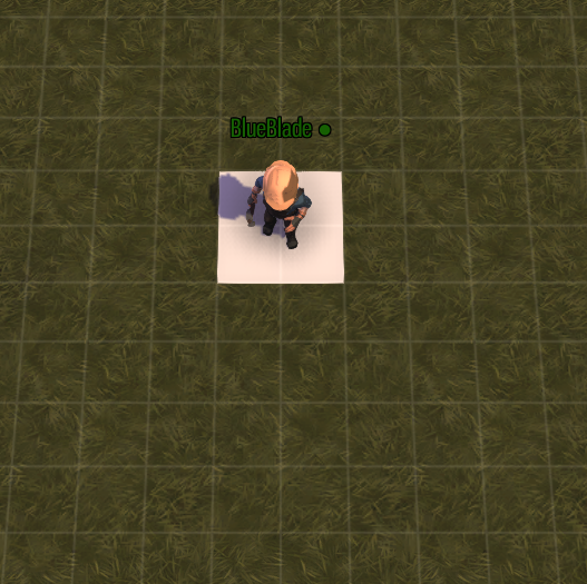
When you first spawn, mark the location beneath you. This is the center of the map.
2. Design Center Area of Play / Chokepoint
Now we get to one of the most crucial areas of building your map, the center area. This area is where you want the guards and thieves to collide and fight it out regardless of the mode. This center of combat should be built 10-20 tiles above the true center of the map, since guards travel slower than thieves and should be able to dig in before thieves arrive. For guards and thieves mode, this center should also act as a chokepoint, where thieves have to travel through to get to the items beyond. (This is taken from the design of classic office). This “hourglass” design ensures no items are too easy to run off with as soon as the match begins if the guards play even somewhat smart. The actual center of combat can be whatever you want. It should include 1-3 medium to large rooms. You can also make a crossroad of hallways the center area like classic office does. It’s important to plan 3-4 ways for thieves to reach this area, so they can flank the guards. At the same time, its important to give guards cover and defensible locations to stave off the attackers. This area is extremely important, and should be 20-35 tiles wide. You don’t have to decorate it all now, just mark out the boundaries and keep a head plan of how its going to turn out.
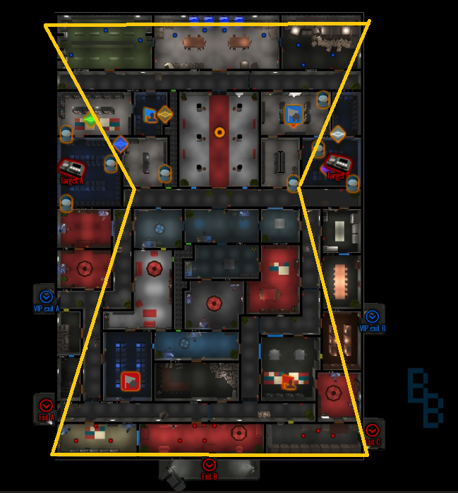
An example of the hourglass formula. The narrowest point is the center of combat.
3. Complete Floor Plan
Now, you have the center of combat complete. It’s now important to map out the rest of the map. Start with placing the walls in the shape of all the rooms. Add hallways in a logical fashion to connect the center area to these rooms. It’s best to do these hallways similar to office, with a couple running down either side and one or two connecting the vertical hallways. Then make the rooms in between these hallways. Make sure to give guards a good hallway route from their spawn to the center. Also, lay out one or two vents if you want them (they are hard to squeeze in later). Make sure none of the hallways go to dead ends. Once the walls are up, start adding doors, windows, and vents in a logical way. You basically want thieves to have full mobility above and below the choke point, while guards are constrained to using the hallways for fastest travel. The choke point is where the thieves should be limited in movement and required to outfight/outmaneuver the guards with flanking or tactics. Now, once you have this huge amount of work done, you’re well on your way to making a map. Just be sure to give plenty of thought to this part, as its crucial to how thieves and guards will advance into your map.
4. Terrain Changes
Now you have a basic layout for your map. Next up is an optional step. Using the terrain feature, you can add some different terrain to your spawns or add water to make the exterior prettier (Water is located beneath the ground, use the height feature to make it visible). Water itself will give away thief locations in the dark, so use it sparingly and only in unimportant areas. Terrain can easily make a map look more interesting and professional.
5. Add Flooring / Basic Decorations
Flooring can greatly affect the appearance of your map. There’s a variety of designs and options to colors of the flooring in each room. I particularly like to stick to a certain color scheme for most of the map, but in reality it’s whatever you want to do. Make sure not to use any dark greens, grays or blacks in important areas. These colors do not light up as well as the lighter colors, and can make rooms look much darker than they actually are. If you are putting a border in the rooms, its best to use light colored flooring for the border. Finally, for the vents use the vent flooring found under textured flooring that has a metallic look to it. Another important part of flooring is covering unused area around the exterior. Use black floor tiling to cover the out of bounds areas of the map and give your map an additional layer of professionalism. As you add flooring, feel free to put down one or two furniture items to tell what each room will be. For instance, maybe drop a desk in a room that will be a simple office room. This can remind you later of what that room is supposed to be.
6. Lighting
Lighting is the second most important part of a map after the floor plan. This is where many, many maps on the workshop fall flat. Lights in the OGAT map maker WILL go through walls. So, if you place a large light right next to a wall, then a thief on the other side of the wall will be visible. To ensure this doesn’t happen, you have to make sure each light is a certain distance from the edge of a wall. For size 2 and 2.5 lights, make sure the light is 2 tiles away from a wall. For size 3 lights, ensure the light is 3 tiles away. Finally, for size 4 lights, make sure the light is 4 tiles away from the wall. Its best to use size 2.5 lights to light up corners of rooms, and then fill in the remaining space with other size lights. Try to do even lighting without overdoing it, as too many lights make the room seem ridiculously bright when playing on it. Also, this lighting restriction means u can not have lit rooms that are 3 tiles wide or smaller, because they cannot be lit with standard lighting. Another caveat to avoid is leaving dark spots in the corners or middle of the room. A good thief can exploit this lack of light and ambush guards repeatedly from an unexpected location. Hold shift next to a light and click lights to connect them to a switch. When connecting lights to switches, make sure you don’t connect a massive space to one switch. It’s better to break up a hallway chain into 2-3 separate light systems than one massive light chain that can be turned on across the map. If connected in a logical fashion, this should get you proper lighting on your map.
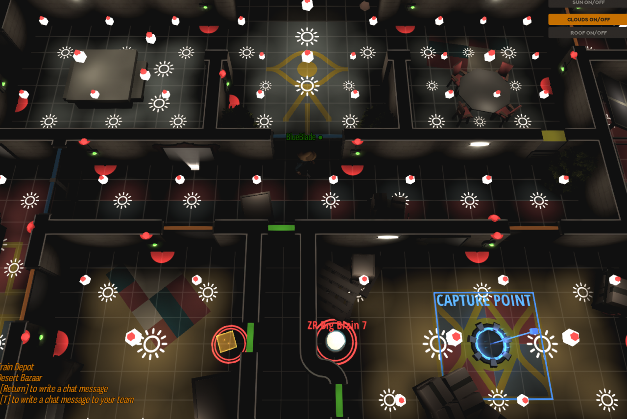
An example of some well-lit rooms
7. Complete Decorations / Finishing Touches
Once the interior lighting is completed, go back and finish decorating the rooms. Decorating is something that improves with practice, but the number one rule is don’t over do one furniture piece in a room. For instance, don’t use the exact same desk 3 times in the same room. There’s 5-6 different desks, try to rotate between them. (This is just an example, but it holds true for all decorations). If the flooring looks empty, add carpets to make them appear less bland. On the walls, put paintings and bulletin boards. In hallways, you can put a bench with a plant, or a box for cover, or even a bookshelf. Just add enough decorations that the map doesn’t feel like a computer simulation, but rather a unique location. There is a knack to decorating, but if you are willing to cycle through the decoration options, you can create some gorgeous maps.
8. Gameplay Elements
Now, you should have enough of the map complete to somewhat see how the game play will flow. Go back and place the game play elements for all the modes that you have not already placed. Put Gat items above the center of combat of the map, but not too close to blue spawn. Make sure to spread them out in a logical way. For Gat, you should place anywhere from 6-8 items for a large map (Don’t forget exit points!). For Ctf, make sure the flags are a similar distance from spawns and that the capture points feel logical. You are going to do testing later down the line, so the initial positions are just your most reasonable estimate to where the elements should go. For DE, try and put one bomb site on either side, and somewhere around the center of combat. (It’s position may need to go up or down depending on just how much of a choke point the center is). For ZR, take a similar approach to the Gat items. However, do not put any brains in a wide open area, as this makes it nearly impossible for zombies to approach and secure the area. For VIP, just try to put the exits at reasonable locations that are not impossible for guards to reach. Finally, make sure you activate all the modes in the settings menu for the map, or else they can not be played in that mode.
9. Roofing
So, here is one of the steps that display the level of care put into the map. There are black squares under roofing, that do two things. First, it blocks sunlight from entering in guard only modes, which some players find annoying. (The sunlight will mix with the florescent lights, making it brighter than it should be). Secondly, it prevents items from going over the walls or bouncing above the walling in some strange way. This effect is most noticeable in mad ball. So, is it a game breaker to not have roofs? No. However, if you want your map to appear professional and well polished, you need to roof the entirety of the indoor area. This isn’t as time consuming as it sounds, since the roofs can be placed in size 5×5. Make sure the roofs are actually over the walls at the sides, or else a small crack of light will come through. This step really helps your map appear and play the best it can.
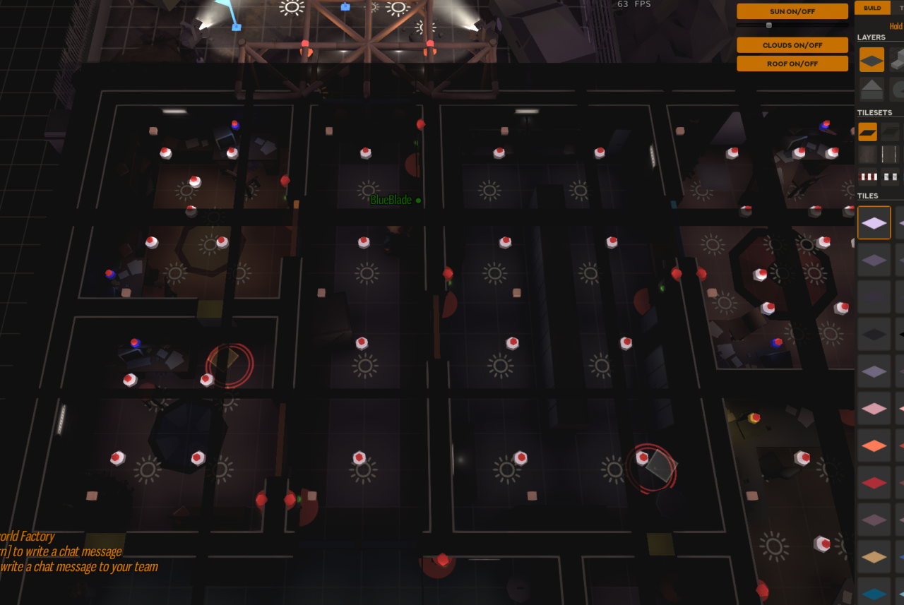
How an indoor map should appear with roofs. These roofs will not be visible in game play and can be disabled at the top right in map maker.
10. Background Lighting / Additional Wall Decorations
This is another polishing step that makes the map look professional and ups the quality of the map. Here you are going to add exterior lighting to the outside areas, just to give the guards some areas they are not blind in. (Don’t overdo it at red spawn if its outdoors). Use the lightsource options and just give some natural light to the exterior areas. Also, go back and add some lights to the interior as well. You can place some of the small rectangular lights around all the rooms. (1-2 per room). Also, maybe put a lamp at good spot. Place some lights under some of the paintings on the wall to give the appearance of a display. Another option is to place some of the size 2 static point lights over a desk to give the appearance of a desk or computer light (I usually use blue or white, just make sure it doesn’t go through the wall). These extra background lights give the thieves something to play around and the guards some visibility in a dark room. If you don’t do this, the areas with the lights off will be just a blanket of darkness, which is boring and unimaginative at best. Once again, this step is a polishing step. Another thing you can do is go back and add more wall decorations where the walls feel bare. I always feel like I have a bunch of bare walls before this step, so I always try to add some more stuff on the walls. It doesn’t affect game play, but it makes it look a heck of a lot better. Once you have done this to your hearts content, you’re ready for the next step.
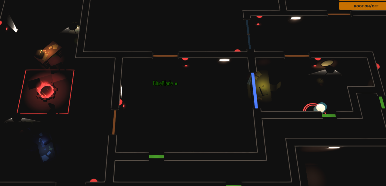
Example of some desk lights and wall lights.
11. Testing
Once you have completed all the above steps, you are ready for testing. Testing can be a difficult process, but very rewarding if you can get it going effectively. The way I usually try and test is to just host a lobby and put something to the effect of “join if you like” or “pls join”. This lets people know you want additional players. Oftentimes if the other servers are dead, they will join your server just because its the only option. I find this to be the case oftentimes from 10 pm to 3 am EST. Europe is asleep, and the mtdm servers are often dead, meaning people will join yours if they don’t want to do just Gat. The other way to get testers is to go to the OGAT discord and make make a comment in the general or map making channels. I rarely get people this way, but I have in the past. Once again, this format works for large indoor maps. If you ever try and make a map for the competitive community, be prepared for a very difficult time to obtain the level of players necessary. However, if you are just making a large map for all skill levels, i find this to work extremely well. Also, be sure to ask for opinions from the people in your server, they often times see the problems you don’t. Be open to ideas and criticism, and focus on fixing the flow and balance of the map. Don’t publish the map until you are confident each mode is at least semi balanced. You have to remember, this might be the only map someone downloads of yours, so you want it to the best it can be.
12. Adjustments
Once you have done some testing, you need to fix the issues you found. Whether its disconnected lights, a place where players get stuck, or the position of an objective, it needs to be fixed. I recommend when it comes to balance to alter things only a small amount, or else you may end up with it being unbalanced for the other side. Once you have made these small changes, you most likely need to go back and test the map again. Repeat steps 11 and 12 until the majority of testers and yourself are happy with the balancing. If it is nearly perfect and you are making only a small change, you may not need to test it again. However, it is best to repeat testing as much as possible if you make a change. A lot of the time this is where my maps get held up, requiring as much as a week to get the testing I feel it needs. The map itself is much better off afterwards though.
Known Bugs
There are several well known bugs in the map maker, and I’m going to talk about them here so you don’t go through the frustration I did. Just gonna list em. Most of them have to do with multiplayer.
- A hosted map making lobby will oftentimes spontaneously crash after 15 minutes to as long as an hour. It always happens, so be prepared. There’s no autosave feature, so SAVE SAVE SAVE. I oftentimes get carried away and have to repeat multiple steps in an already long process. So please, save your map and avoid the frustration.
- Non host players (so friends on your server) can NOT edit any of the light connections or link lights to switches. If they do try, it may very well disconnect the lights instead. They can place lights, but not connect them.
- Non host players can NOT edit terrain in any way. If they do, the terrain will appear to change for them, but in reality it won’t change(no one else can see it) and it definitely wont save. This means the host has to do all the terrain work (regardless of if it is height or just appearance changes.)
- This goes along with 3. Non-host players can NOT see changes to the terrain made by the host. The changes will be saved when the host saves, but all the other people in the server will not be able to view the changes. It may become visible if you reload the map maker after saving it, but I haven’t tried it.
Basic Tips
I’m just going to list some basic tips here I didn’t mention in the actual steps. Please do read through them before you start, as they may be very helpful. I’ll add more later if I think of anything important.
- Make your hallways size 4-5 tiles wide. Double doors are size 4, so I personally prefer size 4 hallways. Size 5 means you have more space, but the doors can never be centered. Also, never use size 3 hallways and in my opinion never use size 6 hallways. They are just massive or tiny in each respective case.
- If you do make your hallways size 4, there is an easy way to light them. Use only 2.5 lights and place them 3 tiles apart in the center of the hallway down its length. This should be a perfect lighting amount for hallways. (You may want the end lights 2 away from other doors and walls to prevent dark spots)
- Don’t connect long chains of hallways or one massive room on a single light chain. This is just annoying to play on and encourages one player from each team to just sit there and flicker the lights repeatedly.
- Make sure furniture in front of doors does not catch them when you open them. Its possible a furniture item can jam a door open, which just appears bad and is once again annoying.
- Do not use breakable doors. There are exceptions, but most of the time no one wants to put up with them. In 14 or something maps, I’ve used 1 breakable door. If you use only breakable doors, you basically are making life torture for the poor thieves.
- Don’t leave dark spots in your lighting, thieves will hide there and exploit it. (I think i said this above somewhere, but it’s worth repeating)
- If you have large rocks on your map, make sure they can not be climbed or exploited in anyway.
- Make sure to double check your out of bounds borders to ensure nobody can get through it. (Some decorations that appear to be a blocker may not. Example: benches, rocks)
- Be extremely cautious with teleporters, drivable vehicles, and water placement. Each one can break balance on a map if not used with extreme caution. (I usually just don’t bother with them.)
- Don’t put a ton of “secrets” on each map. Most likely, the majority of people who download your map will play it once or twice. They aren’t going to go digging for some secret and if its game breaking they may never play the map again if other players are exploiting it. (As I said, a small secret is fine, just don’t go overboard with Easter eggs in your map.)
- Don’t build a map around an unusual gimmick, most players don’t want them. (Connecting all lights to a master switch, making an important one way switch, putting spawns at places all over the map, putting gat exits at places in opposite corners of the map) I’ve seen it all, and yet to see one that shines at it.
- Don’t clutter the map with too much decoration. People are trying to aim, not avoid the 70th chair you put in the room. (I’m somewhat guilty of this)
- Don’t make your hallways too long, then they just become a massive long range shoot fest for the guards. (Basically, don’t make it longer than the hallways on office). Also, it helps to have cover in the hallways and adjacent rooms. Don’t just put a hallway from point a to b, have flanking options to go around it.
Advance Pathing Options
So, there are some advance pathing options, if you are willing to put up with the headache of balancing them in your map. (By advance I mean it offers a different, unusual approach that may have far reaching consequences.) I’m going to highlight a few here and give a quick synopsis of its uses and purpose.
- Teleports – Teleports give a the ability to instantly move to a different area. These aren’t terribly difficult to figure out, but can be game breaking if placed incorrectly. Personally, I think teleports are best used in guard modes ONLY, but if you want them in a generic map you can do so. Just make sure the teleports are obvious to both teams where they exit, and don’t allow the teleports to go to OP positions or bypass an important choke point. If you are cautious and think it through, teleports may be a unique flanking or movement option for either team.
- Platforms – Platforms are high flooring options that can only be accessed by ramps. While you can use them to create a route with only one entrance and exit, be aware that shooting off of these platforms can cause problems. Platforms make you fire higher, which means some cover (such as boxes and crates) can actually be shot over by the person on the platform. This can be annoying if you don’t take it into account. Additionally, roofing creates some strange issues with platforms. If there is a roof above a platform, a player cannot go up on the platform and will run into the roof while advancing up the ramp. Additionally, if the rest of your map is not roofed, players on platforms can fire down into other rooms (sometimes even 2-3 rooms over). Please take this into account when using platforms. If you don’t want players to be able to shoot or be shot from platforms, you can place 1×1 roofing around the platform. This will prevent all shooting to and from the platform.
- Ramps – Ramps can be used to make one way entrances. If you want players to be able to go through the area, but not back through, you can use a single ramp as a way to block their return movement. It’s not crazy useful, but can come in handy in some situations.
- Cone Doors – placing a large cylindrical cone behind a door can also create a one way entrance. It does basically the same thing as a ramp, but prevents firing and visibility (Depending on if you use a glass or solid door). Once again, it has some limited uses.
- Red/Blue Barriers – the barriers under game play -> spawn can create barriers that only the matching color can move through. I believe this is more useful for guard only maps, but still are an option. These barriers do not prevent shots from passing through, only movement.
- Drivable Vehicles – I haven’t seen a map yet that properly uses vehicles, so I express extreme caution on using them. However, they can be used as a rapid, albeit clunky, way to cross a map. Additionally, they can be use to block entrances by parking them in front of doors in a way that prevents the other team from accessing the driver’s seat. So, I guess use them at your own risk. (There are nondrivable vehicles under layout if you just want some vehicles for decoration.)
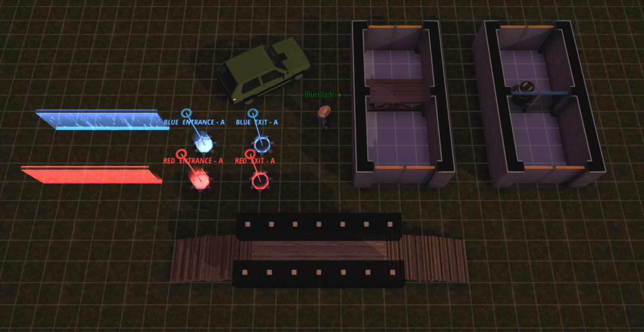
Some advance pathing options
Advance Decorating Options
As I said before, decorating an OGAT map does have a knack to it. I’m designating this area to some examples of how to stack elements to create unique decorations. Basically, if you really want some crazy unusual decorations, you need to use elements from layout, furniture, ground deco, and maybe even flooring or lighting. Since these elements are from different categories, they can be placed over each other (without deleting the other decorations). Using this concept, you can create some unique decorative options. This is just a brief list to get your mind turning on how to stack these elements.
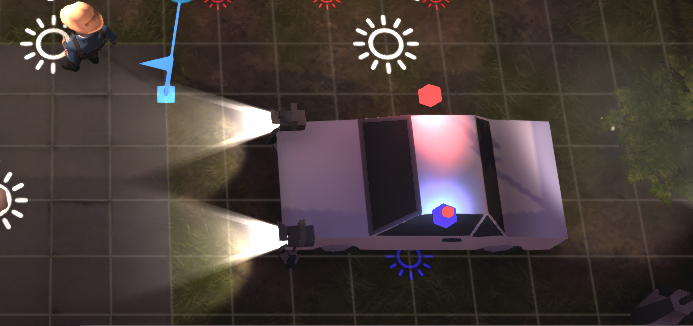
- Police cars – I don’t know who came up with this idea, but I’ve seen it used on several maps, and it’s real easy to do. Just place a white car from layout and place a blue light and red light above the cab. Maybe add two beam lights from the lightsource section as headlights. Easy to do and looks great.
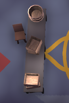
- Table Objects – This is another easy one. Just place a table (preferably a longer one) and then place another furniture decoration at the end, like boxes. It’ll poke through the table, making it appear as though the boxes are on the table. Its even easier if you put rocks under the table, since it is not a furniture element and can be put on the same spot as the table in question.
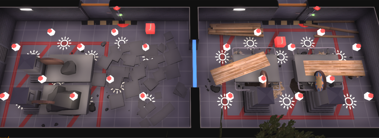
- Machinery (Saw Table) – I love some industrial grade cutting equipment. Making it on ogat is actually pretty easy. Just put a stone table down, then place a large gravestone at one end. Using the roofing option, add a circular picture above the table to create a circular saw blade. Then add a wooden bench coming to the table to make it appear as though it is being loaded. Finally, add some wood chips around the table to complete the idea. I know that sounds complicated, but I added pictures to help. You can also make a stone version!
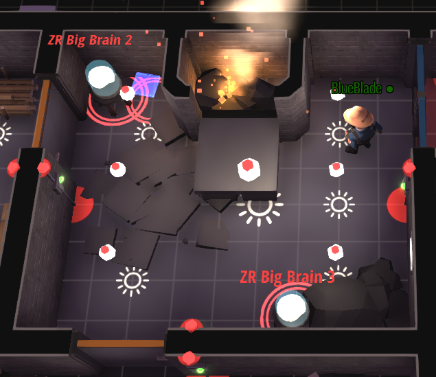
- Furnace – To create a furnace, simply make a small box with thin walls. Then put black tiling inside it and medium or small rocks on top of that. Finally, put some lanterns or camp fires beneath the rock to give it a smoldering appearance. Hopefully the picture will help.
 These are just some ideas I’ve used on past maps, that can be applied to many scenarios. There are many many many more ways to combine the decorative options and give a unique appearance. I’ve made Egyptian columns, Gym equipment, fire trucks, and even a train using the stacking technique. The biggest thing is just keep trying different decorations until you get a stack of elements that makes the look you want. Hopefully these examples will help some, and there are many examples on maps in the workshop as well (I’d take a look at some of Mr. Fun’s maps in the workshop for some really good decorating).


 These are just some ideas I’ve used on past maps, that can be applied to many scenarios. There are many many many more ways to combine the decorative options and give a unique appearance. I’ve made Egyptian columns, Gym equipment, fire trucks, and even a train using the stacking technique. The biggest thing is just keep trying different decorations until you get a stack of elements that makes the look you want. Hopefully these examples will help some, and there are many examples on maps in the workshop as well (I’d take a look at some of Mr. Fun’s maps in the workshop for some really good decorating).
